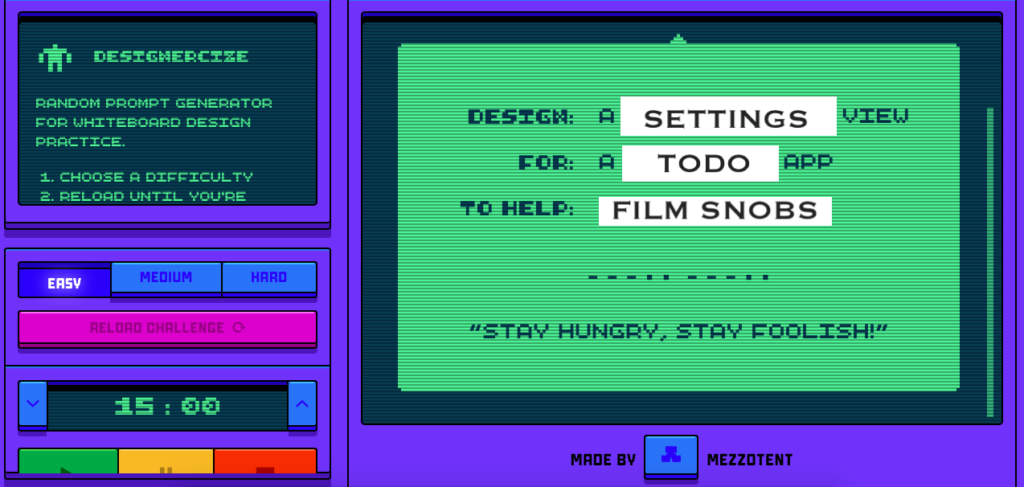
- Challenge: Design a settings view for a todo app to help film snobs
- Difficulty level: Easy
- Time to solve the challenge: 15 minutes
- Assumption: Here the todo app for the film snob is for personal use
Thoughts behind the design
A film snob is defined by Urban Dictionary as someone who takes movies and get into the specifics, such as plot, cinematography and other tidbits about a film rather than the enjoyment. They are often know to ruining movies for others.
For this challenge, I assumed the film snob likes to:
- review movies of different genres
- rate movies based on different categories (example: director, writer, cinematographer)
- blog reviews on their site
- publish it on their other social media accounts
… and is using the todo app to help track and complete tasks associated with this.
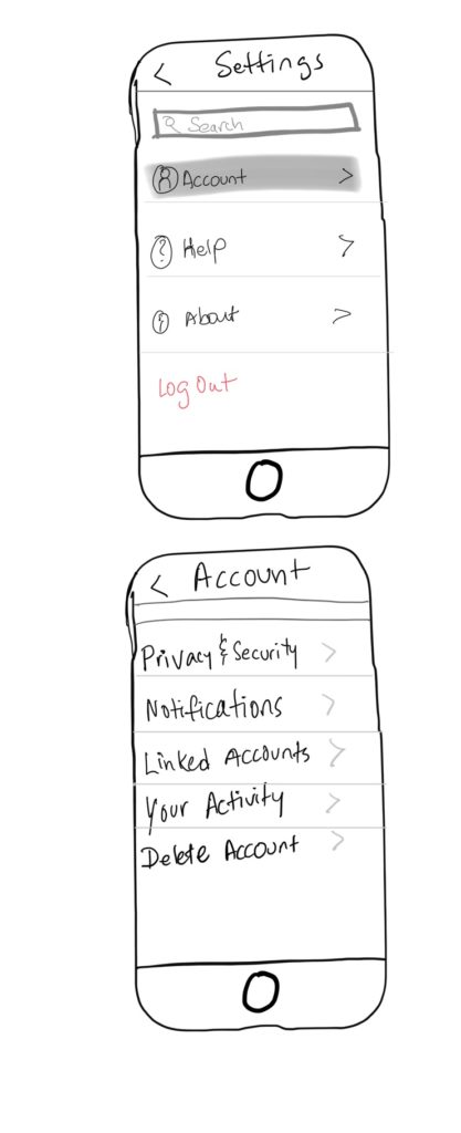
Settings View; the flow
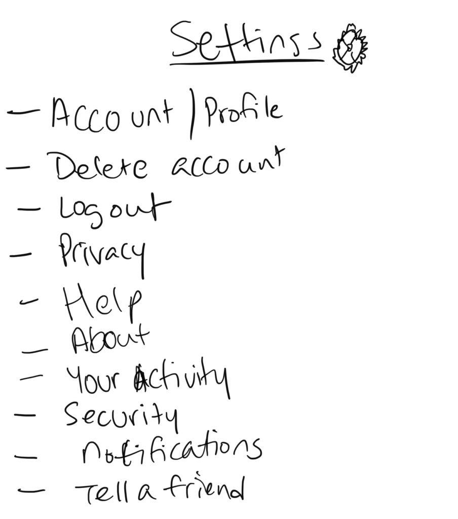
First version: I first listed down the items that I think should be part of this app. It’s not in the order.
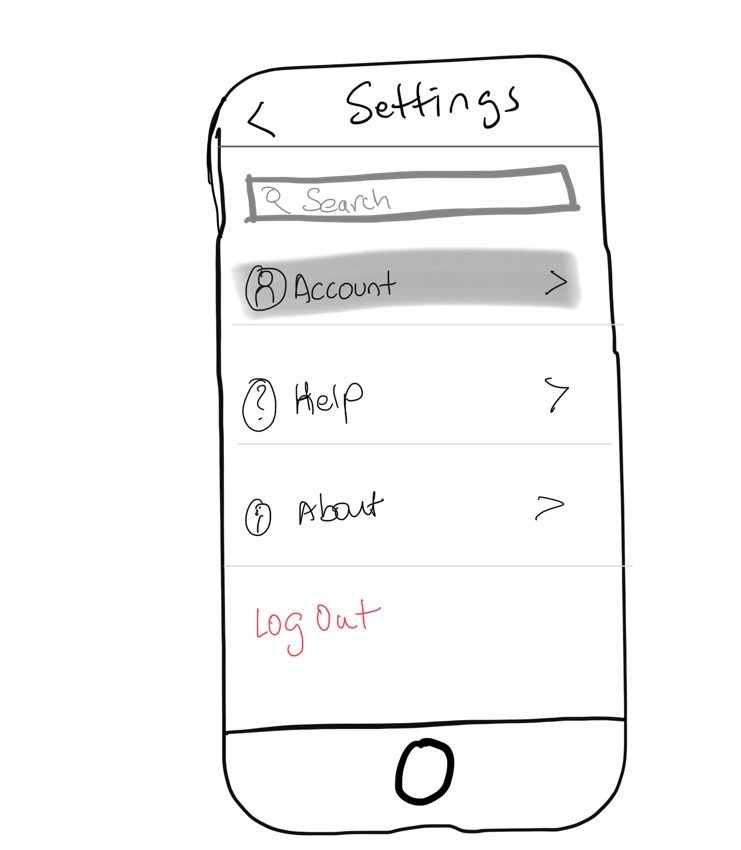
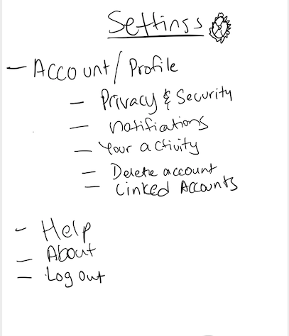
Second version: I grouped them into main categories and then sub categories. This is because the settings function can be very detailed and I like to keep the first appearance as clean, neat and minimal.
Final Design
