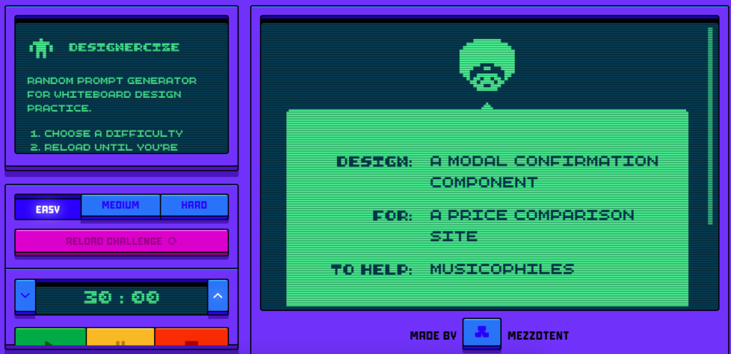
- Challenge: Design a modal confirmation component for a price comparison site to help musicophiles.
- Difficulty level: Easy
- Time to solve the challenge: 30 minutes
- My approach: Researching music subscription modal styles, sketching the design
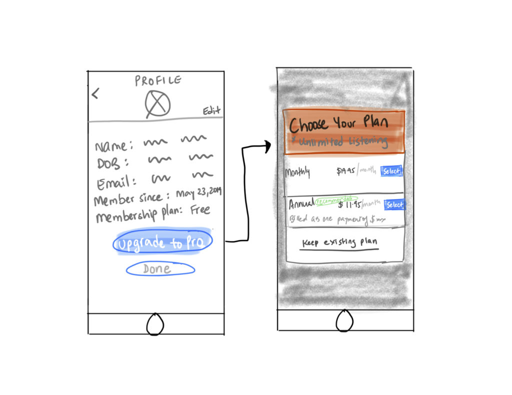
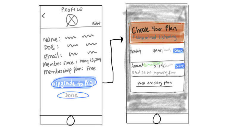
- Assumption: Here I’ve assumed that it’s a music app (like Spotify, iTunes) and the user has a free membership plan and is considering upgrading its membership to get unlimited access to music. The modal component designed will display the membership plan options for the user to compare and select from.
Design
- In the design, under profile, user can access their information and view the membership plan they’re on. For now, its assumed the user is on a free membership plan where there’s a limit to downloading musics, tuning, etc.
- The user is considering upgrading their plans and so there’s an option to “upgrade to pro.” The user selects that and a box appears with the plans available (monthly and annually plan).
- The user can compare the prices, notice the recommended membership indicated by the app in green (next to annual membership) and select the option they’d like to go ahead with.
- There’s also the option of keeping the existing (free) plan, should the user decide otherwise.