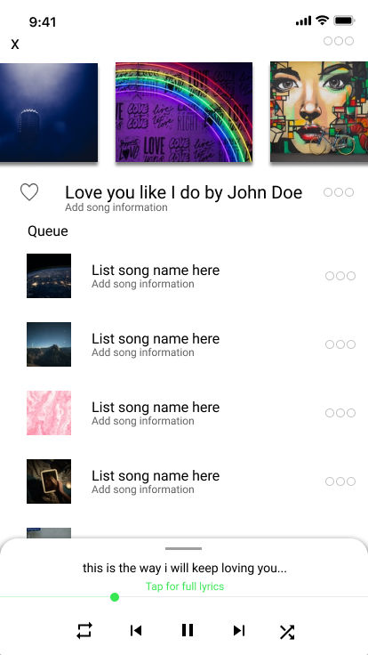
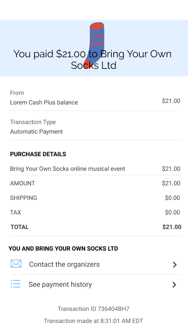
Daily UI
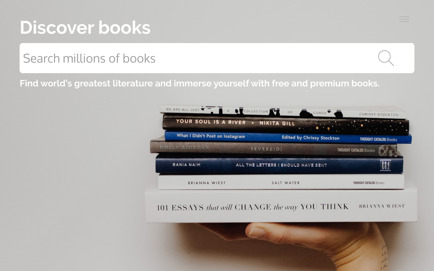
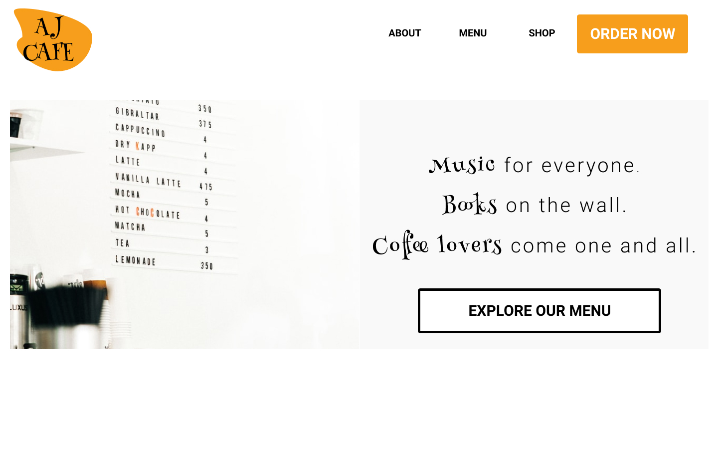
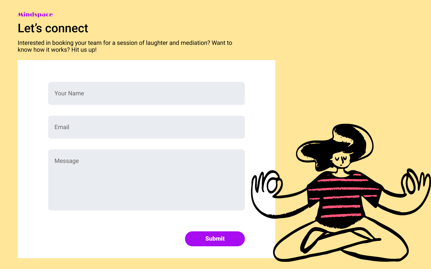
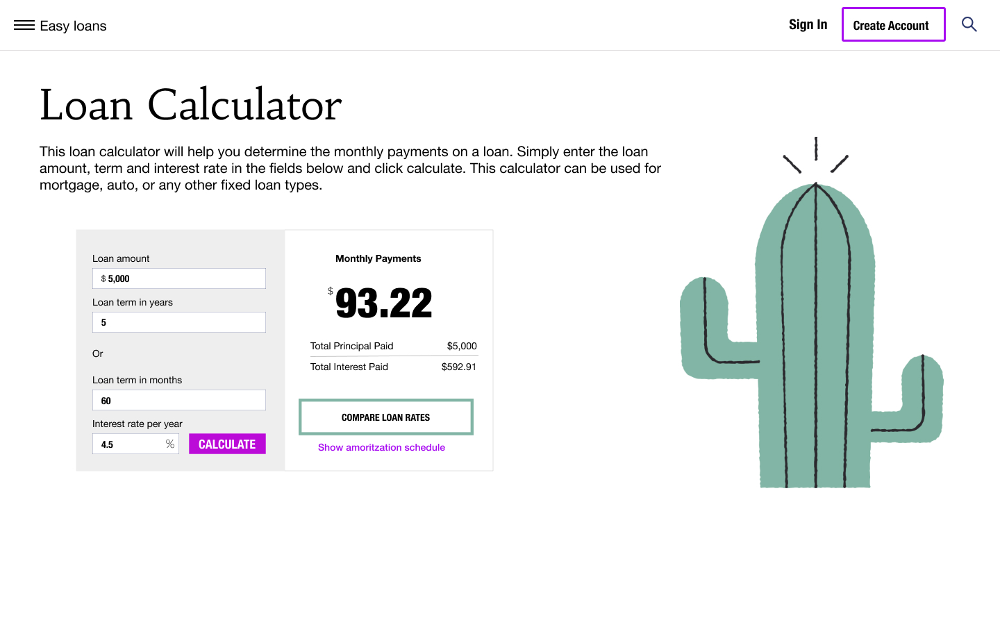
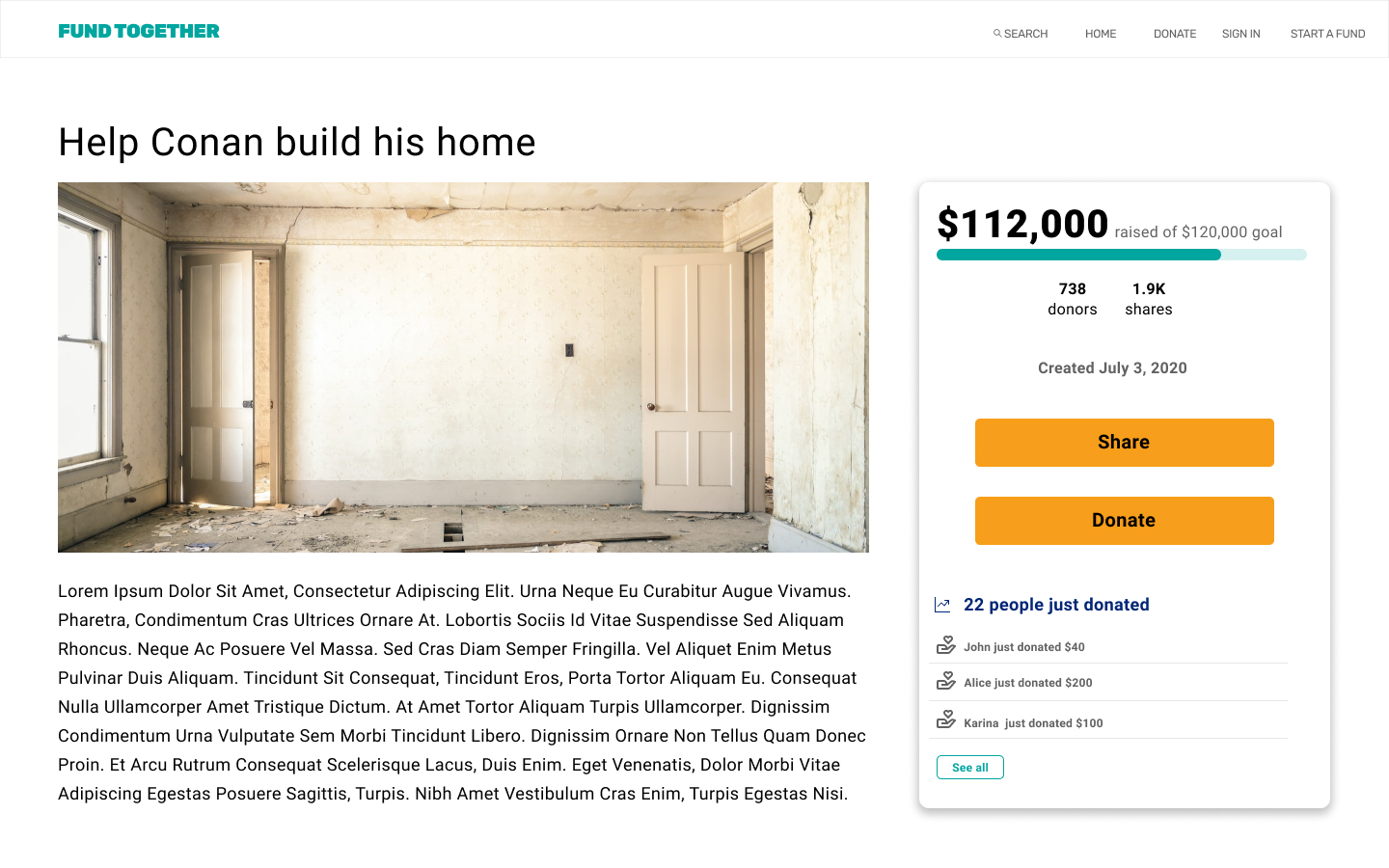
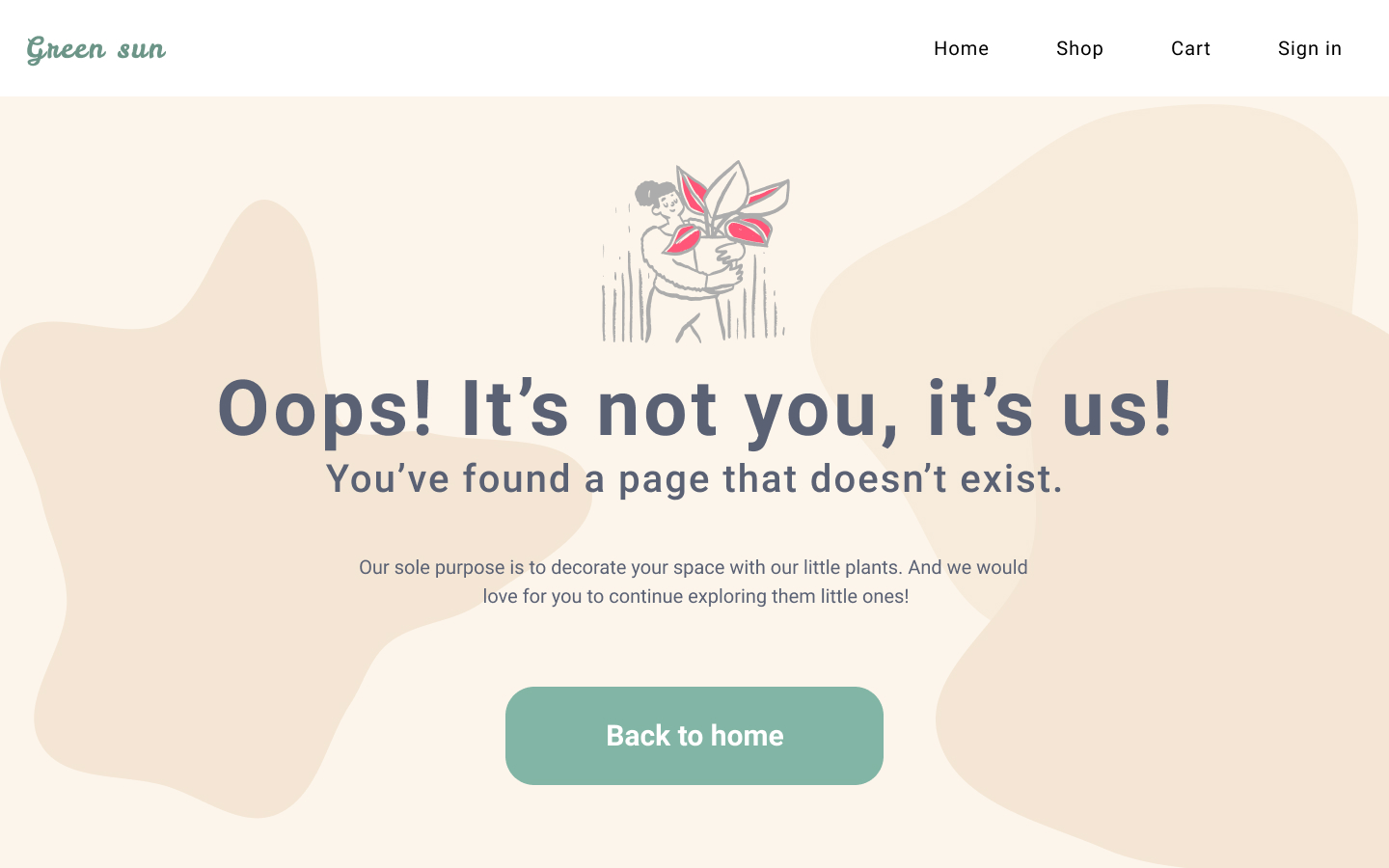
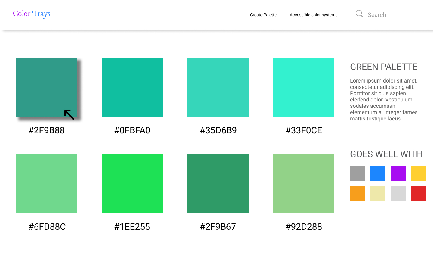
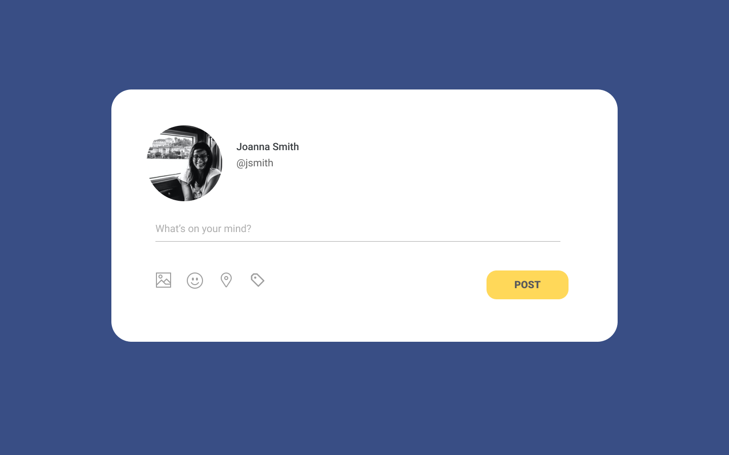
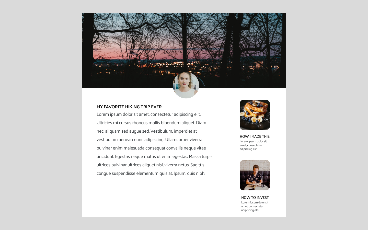
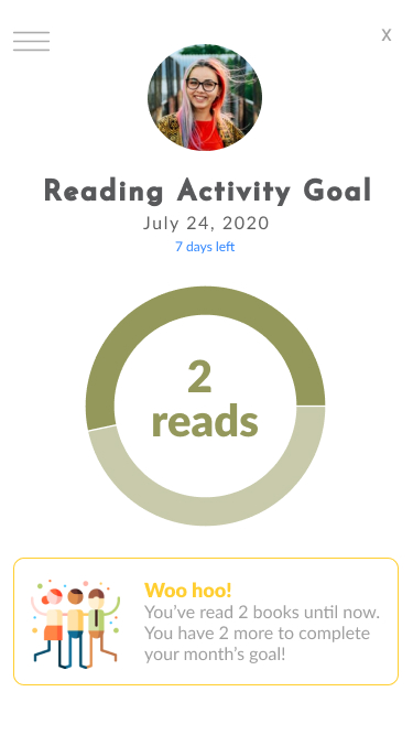
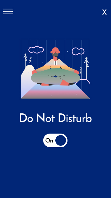
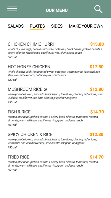
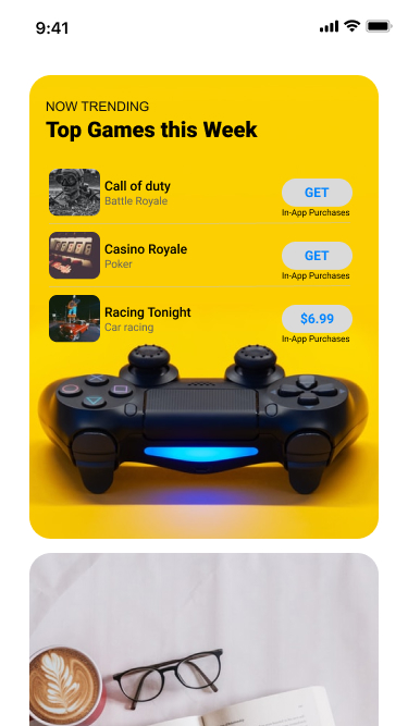
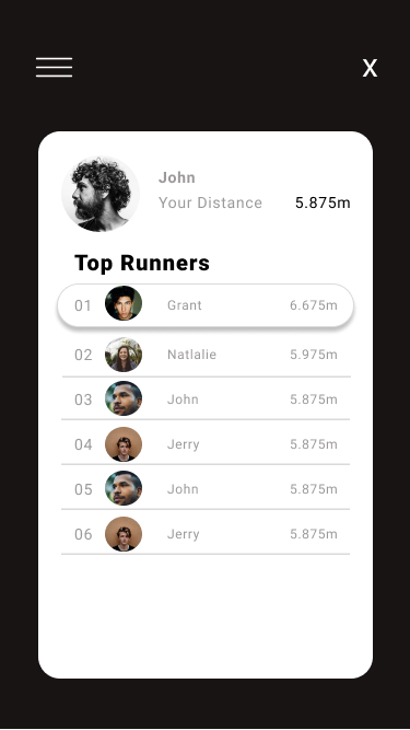
I would recommend this hands down to anyone transitioning to UX, to keep the creative juices flowing. I had subscribed to 100 days of UI and this helped me turn into a much better designer.
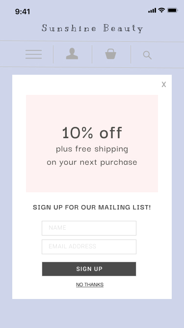
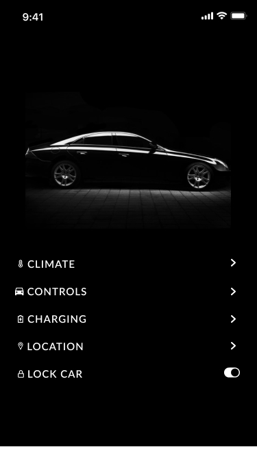
The approach is to spend about an hour daily, where I would design a web page or mobile screen using Figma.
My style guide preference: minimalism, modern with lots of white space.
Daily UX
I love doing these challenges when I get a chance as it keeps me thinking and breathing UX.
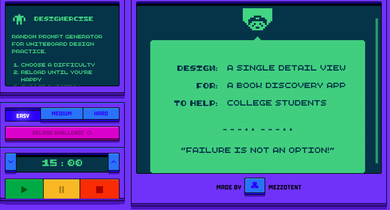
The approach is to spend about an hour on each challenge, where I research on the topic, sketch solutions and try to get feedback and test them if I can. I use the UX challenge generator, Designercize. Check them out, they're pretty cool.
Do note: These challenges are intentionally not UI focused, and I only create paper sketches, so I can use the hour to focus on the research and thought process behind my design solutions.
Challenge: Design an onboarding process for an app that likes your friends' social media posts for you Difficulty level: HardTime to solve the challenge: 15 minutes My approach: Made notes of the features I wanted the app to have, had a look online on other similar apps, paper sketched the screensAssumption: Here I've assumed that it's an app that will help you like posts of your friends from Facebook and Instagram and you can schedule the frequency of likes per day, the type of posts under Settings. Research This reminded me of the apps that lets users schedule when to…
Read more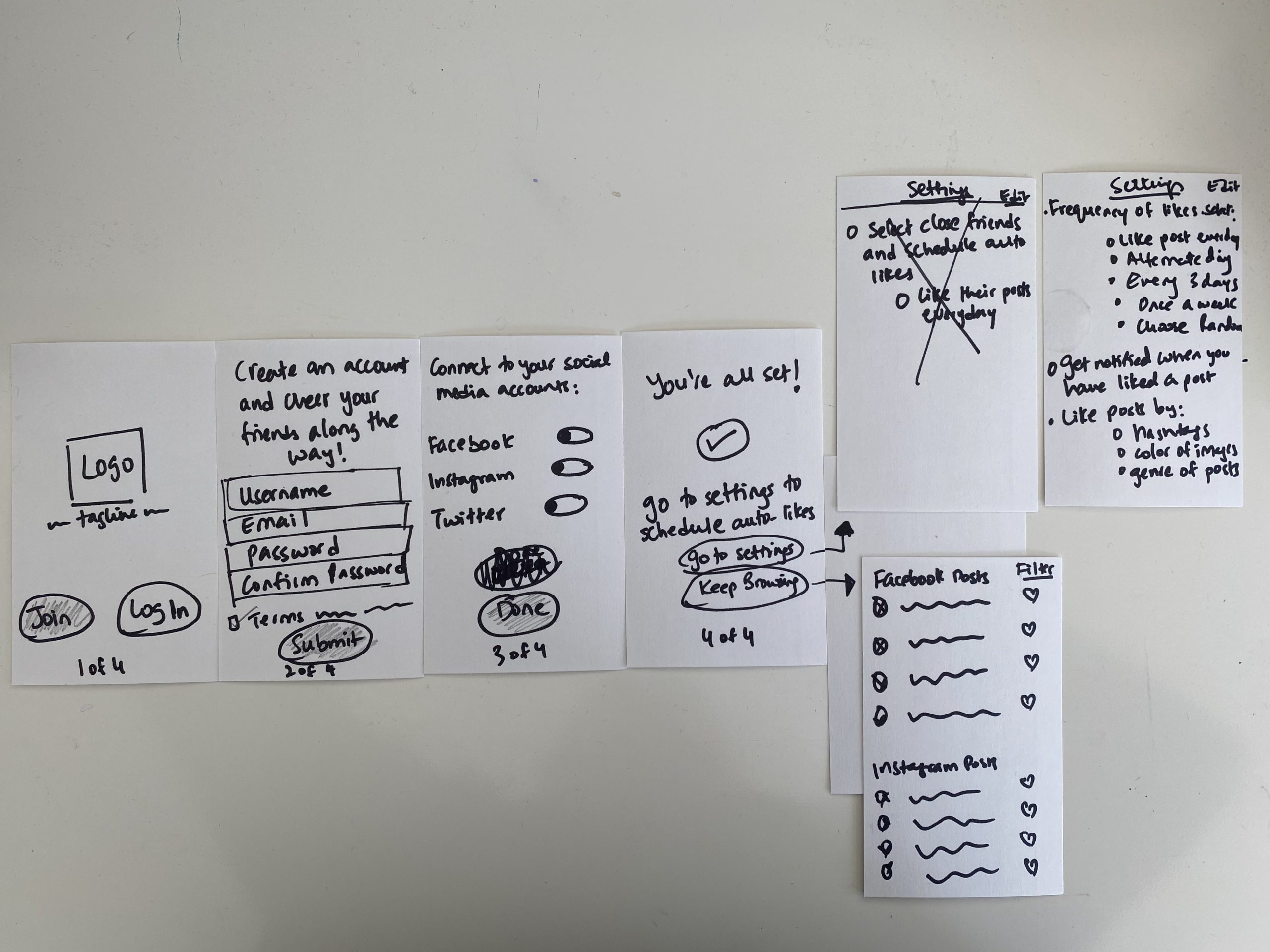
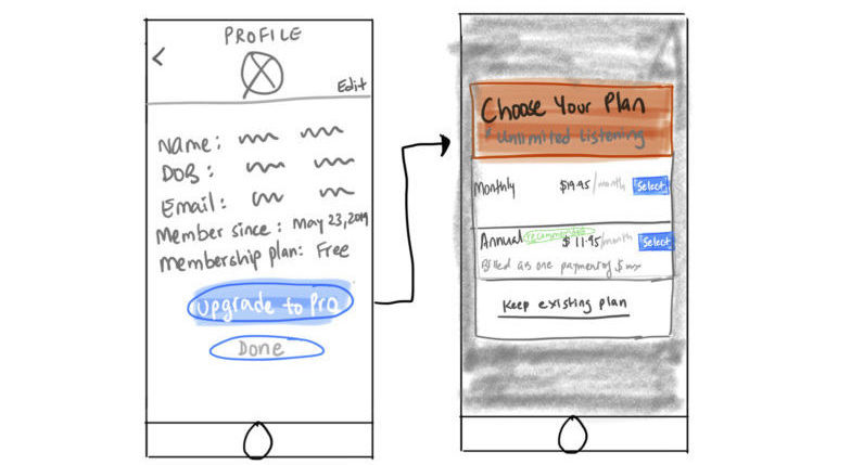
Challenge: Design a modal confirmation component for a price comparison site to help musicophiles. Difficulty level: Easy Time to solve the challenge: 30 minutes My approach: Researching music subscription modal styles, sketching the designAssumption: Here I've assumed that it's a music app (like Spotify, iTunes) and the user has a free membership plan and is considering upgrading its membership to get unlimited access to music. The modal component designed will display the membership plan options for the user to compare and select from. Design In the design, under profile, user can access their information and view the membership plan they're…
Read moreDaily Challenge #7: A login and create account feature for a dating app to help high school students
Challenge: Design a login and create account feature for a dating app to help high school students Difficulty level: Easy Time to solve the challenge: 30 minutes My approach: Research on the apps currently existing, review on some of the apps by high schoolers on YouTube, designing features, testing it with two students and applying their feedback.Assumption: This is a big concern. I have designed the screens assuming it's used by 13-17 years of age. This is a sensitive topic and the biggest concern is safety and trying to find a balance between how much high schoolers want or should…
Read more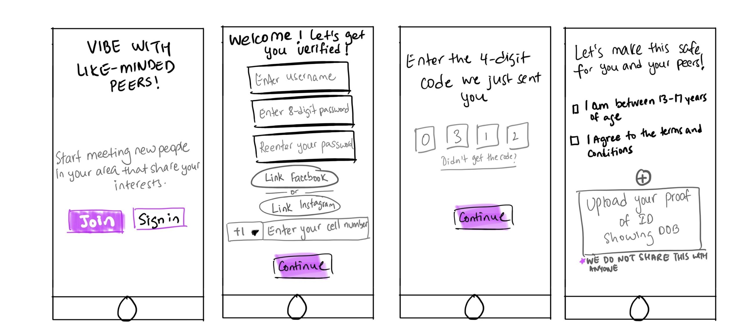
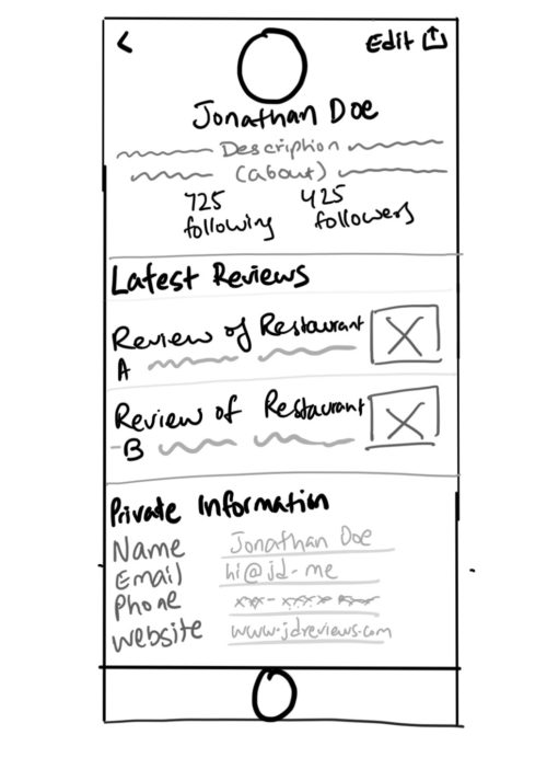
Challenge: Design a user profile view for an insult generator to help restaurant patrons Difficulty level: Easy Time to solve the challenge: 15 minutes Assumption: I LOVED THIS ONE! I assumed here that the restaurant patron is using a blogging app (like Medium) to review the restaurants they visit, and this is for personal use. How cool would it be to have an insult generator to make your posts a lot more fun. Similar to Gordon Ramsay's style. Thoughts behind the design I assumed here that the restaurant patron is using a blogging app (like Medium) to review restaurants they…
Read moreChallenge: Design a login and create account feature for a weather app to help single parents Difficulty level: Easy Time to solve the challenge: 15 minutes Assumption: Here the weather app for the single parent is for personal use to track if the weather is making sudden changes that might affect the schedule and activities planned for their kids (example: outdoors) Thoughts behind the design A single parent would want to be updated whether the weather is changing or not and if it would affect the kid's scheduled activities. Under create account, I added form fields to enter in location.…
Read more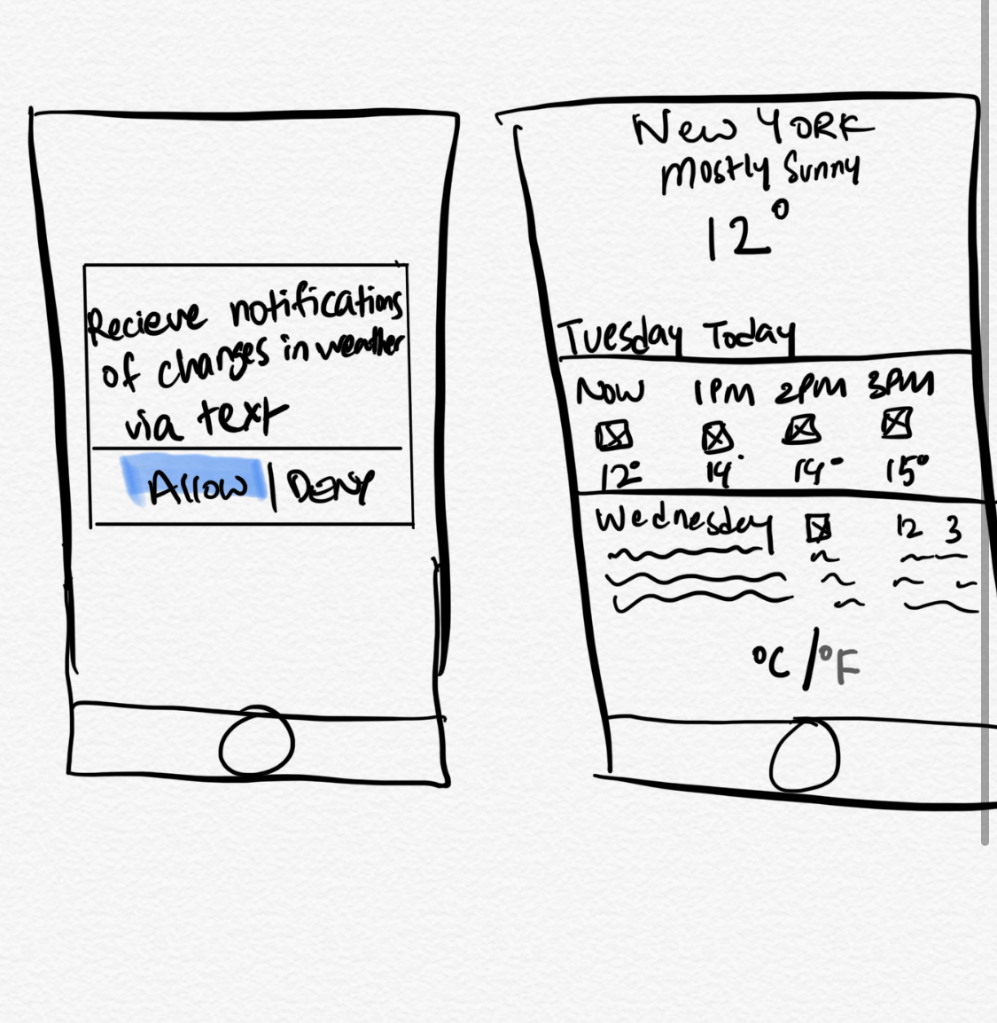
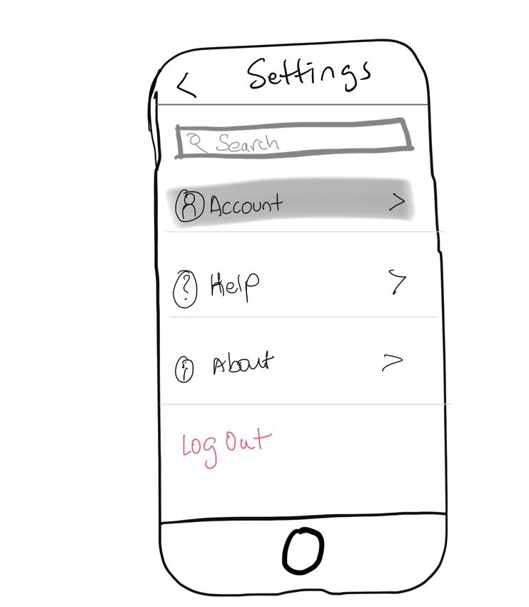
Challenge: Design a settings view for a todo app to help film snobsDifficulty level: Easy Time to solve the challenge: 15 minutes Assumption: Here the todo app for the film snob is for personal use Thoughts behind the design A film snob is defined by Urban Dictionary as someone who takes movies and get into the specifics, such as plot, cinematography and other tidbits about a film rather than the enjoyment. They are often know to ruining movies for others. For this challenge, I assumed the film snob likes to: review movies of different genres rate movies based on different categories (example: director, writer, cinematographer)…
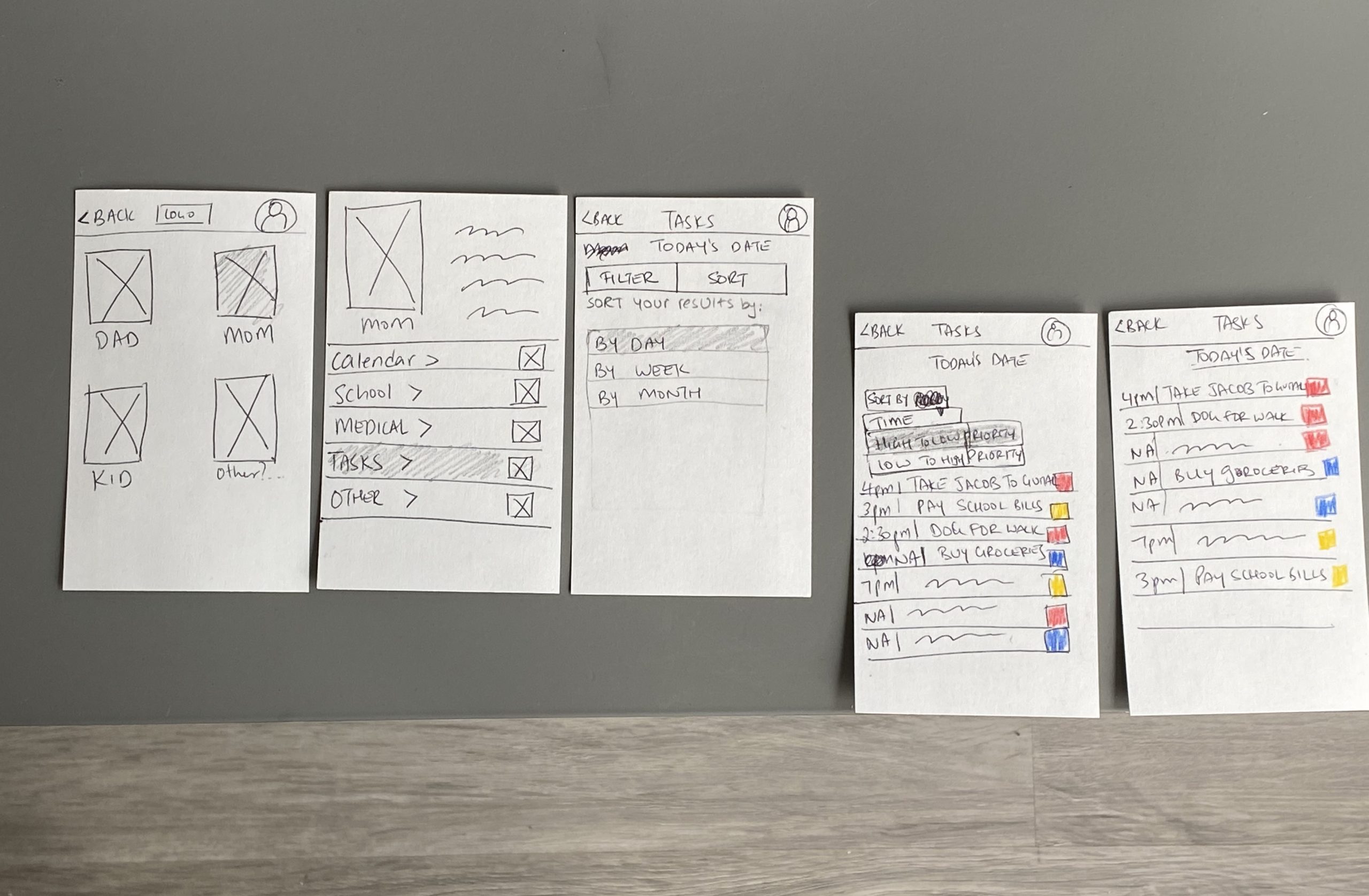
Read moreChallenge: Design a sortable list view for a scheduler app to help single parentsDifficulty level: Easy Time to solve the challenge: 15 minutes Assumption: Here the single parent is a mom sorting her tasks for the day This one I was unable to finish within 15 minutes and took 40 instead. I was trying to think about the different options a single parent could sort from and yeah, it just took some more time! 
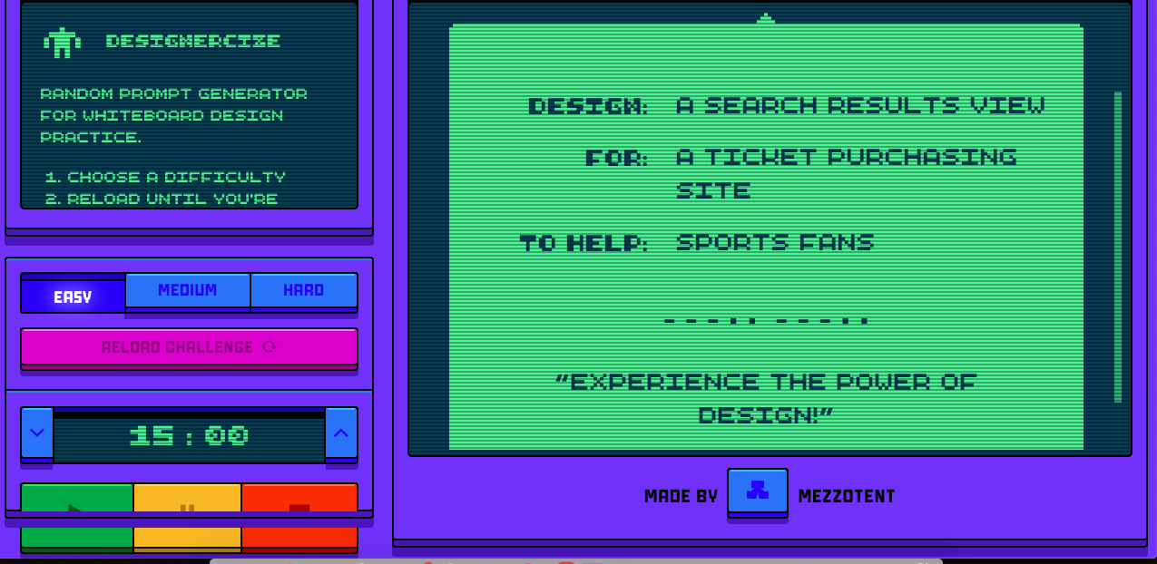
Today's challenge was: A search results view for a ticket purchasing site to help sports fans. Difficulty level: Easy Time to solve the challenge: 15 minutes Assumption: Here the assumption is the sports fan is a returning user Thoughts leading to the design I'm not much of a sports fan, so this one was a little interesting for me to think like a sports fan and what they'd want as part of their search results. I took inspiration from Ticketmaster and StubHub - both sites that I use a lot. Between the two, I like the single-row view of the…
Read moreToday's challenge was: A single detail view for a Book Discovery App to help college students. Difficulty level: Easy Time to solve the challenge: 15 minutes Assumption: Here's the assumption is the college student is a returning user Thoughts leading to the design For this design, I took inspiration from the website Built in NYC, which provides a single detailed view of their job section. I quite like that style and have used that as a reference for sketching for this Book Discovery App for College Students. (On a side note, their app version wasn't as good as the website…
Read more