Curious Mints: Website Design
Project Overview
About
Curious Mints is a company focused on developer education, dedicated to providing free tutorials to developers who want to learn and build new skills on the side.
Brief
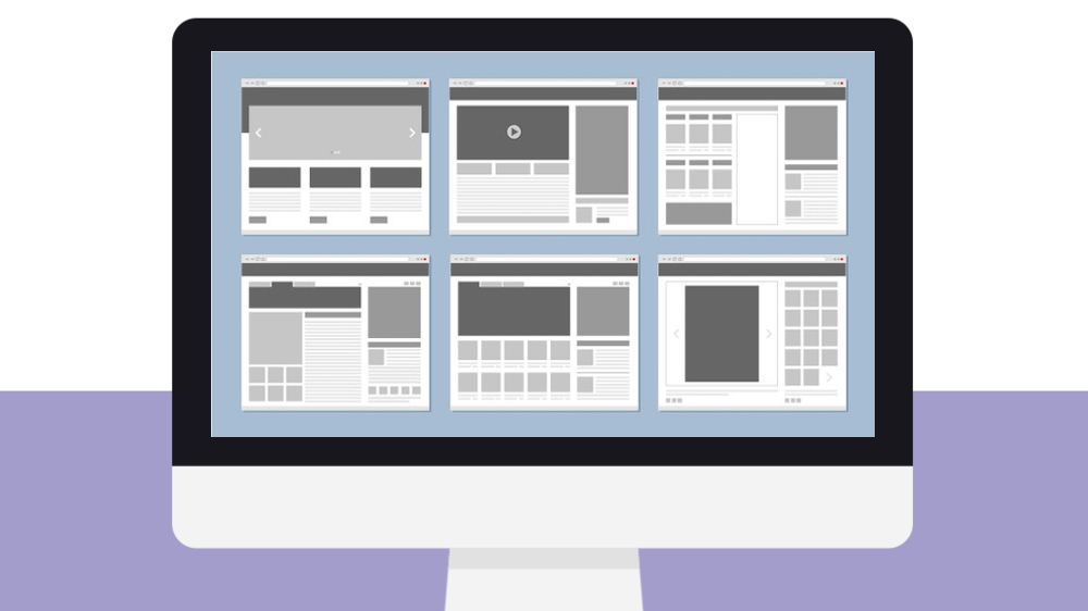
To create a responsive website for their newly launched company.
Duration: 8 weeks
My role
Worked with the founder and led the design studio from start till end in creating a website that would align business and user needs. Collaborated with their in-house visual designer and developer to bring the product to life.
Tools & Method
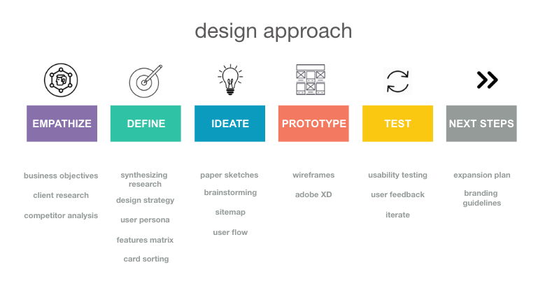
Client research, user research, competitor analysis, synthesizing data, user personas, feature prioritization, closed card sort, sitemap, user flow, paper sketches, mid-fidelity wireframes, usability testing, visual moodboards (icons, colors, typography, image style, buttons, links, content).
Tools: Miro & Adobe XD, HTML & CSS
Stage 1 – Empathize
Client objective
In our kickoff meeting, to understand their needs, the founder and I covered conversations revolving around market trends and increasing need for developer education, company’s goals, key competitors, target users and challenges faced within the developer community.
Free tutorials at beginner level for developers to learn in a fun and simple way.
“User registration not required. No signups, no credit cards, all free, and super easy.”
Competitor analysis
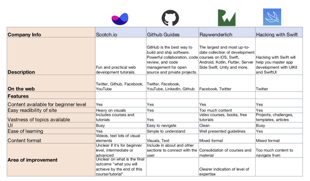
We looked at four other competitors offering similar services and did an analysis on key features important from a user’s point of view.
Strengths
- extensive education-based tutorials and courses offered
- ability to achieve long-term goals
Areas of improvement
- hard to navigate
- busy UI
- lack of clear indication if the material is for beginners, intermediates or advanced level users
User Research
The client is a developer evangelist himself and has hosted over 300 hackathons in his career. He had interacted with a lot of developers and knew exactly where the problems lied and shared an extensive list of user pain points and goals identified over time. I made my notes based off that and began the next stage.
Stage 2 – Define
Synthesizing research
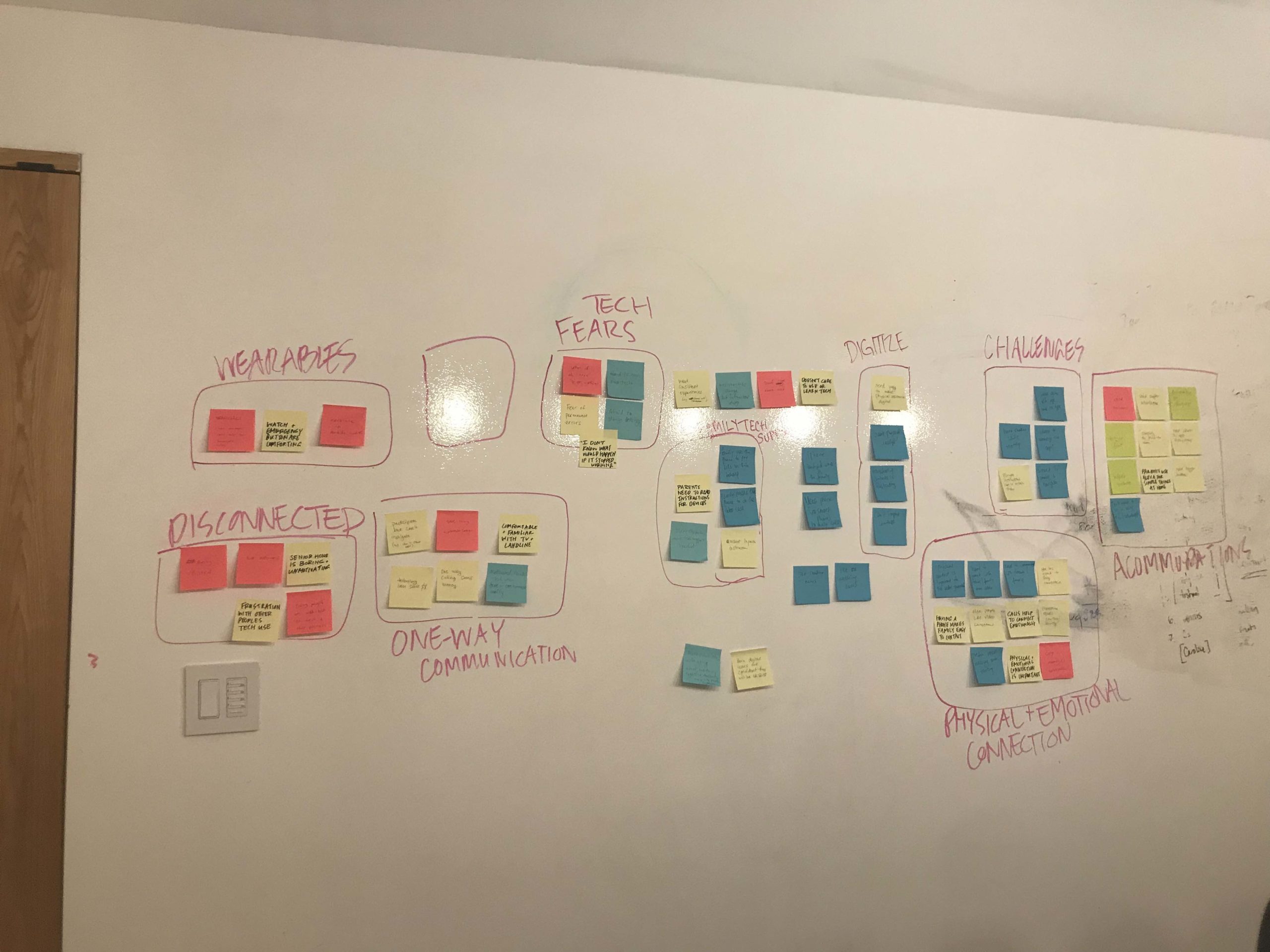
I did an affinity map and defined the key elements we needed to focus on.
Design Strategy
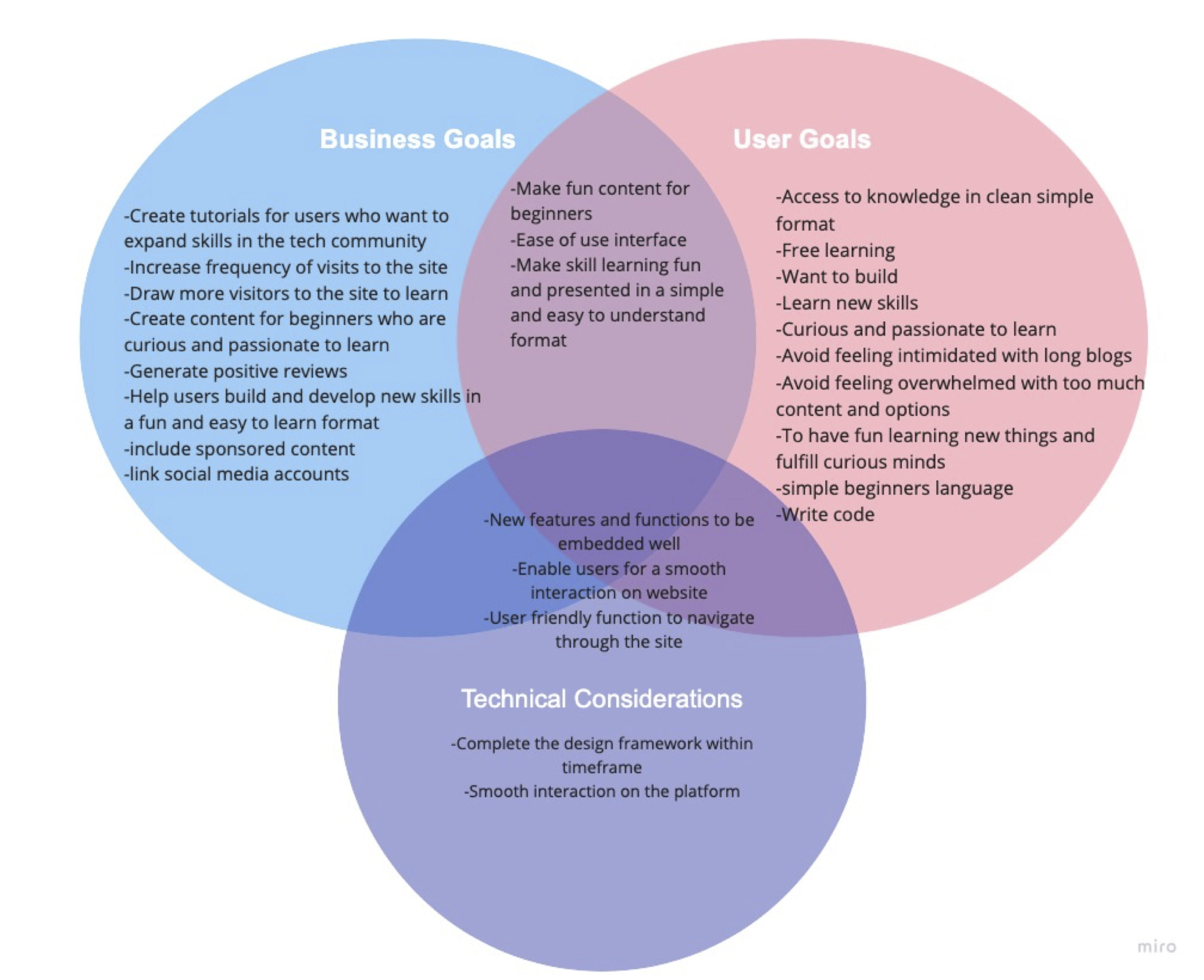
I presented a Venn diagram to summarize and align vision of the company, needs of their users and technical considerations in getting this live and functioning at the earliest.
With Curious Mints, we wanted to make sure they stand an advantage by:
- communicating clearly who their target audience is
- making sure the content can be easily navigated and searched for, and
- using a clean format in which tutorial content should consist of narrative text with lots of code and gifs rather than videos.
Clear communication
Intuitive navigation
Tutorial format with narrative text, more code and gifs
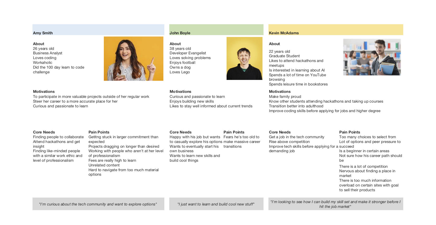
User Persona
The founder shared an image with me and said “this is exactly I want to do and whom I want to do it for. It’s as if I am writing for myself but only 3 years ago.”
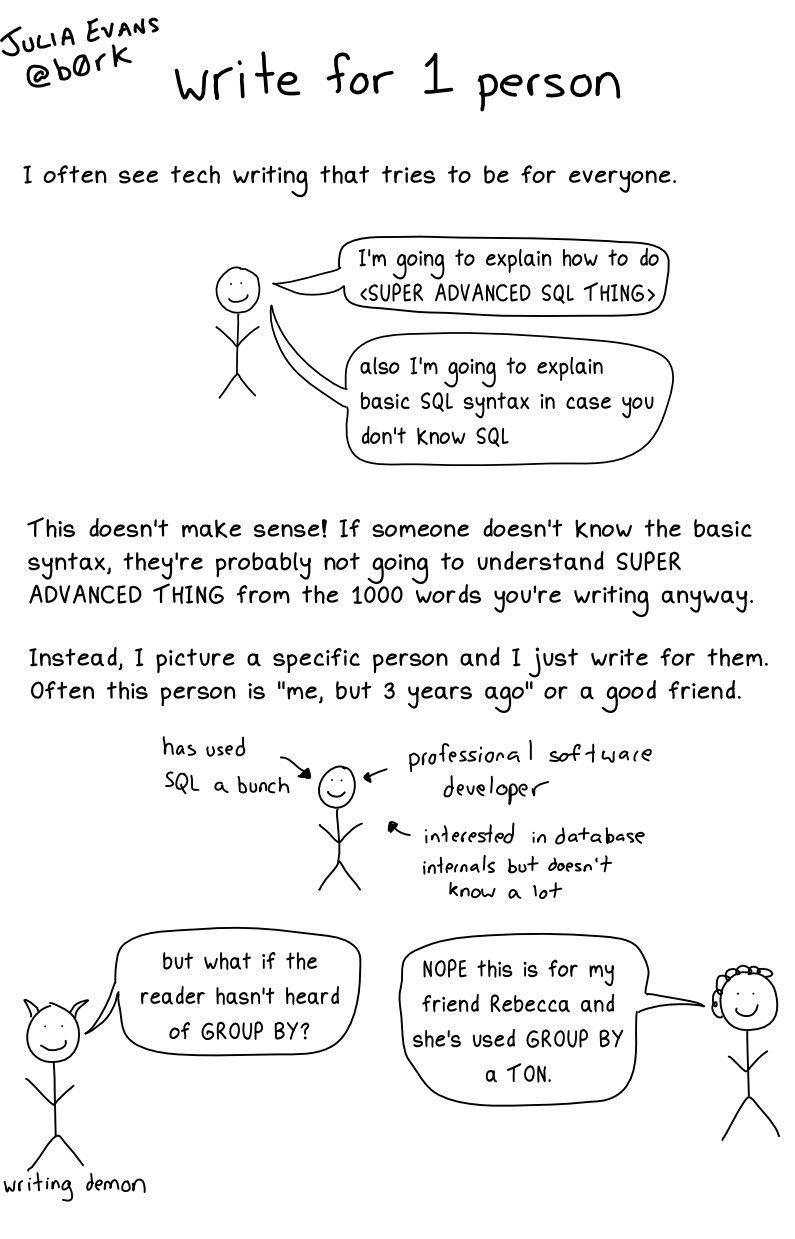
Based on this vision and our findings, we came up with three types of primary users: students, working professionals, career changers.
Audience
Age range: 21-40 | Gender: All inclusive | Industry: Tech
People with basic working knowledge of at least one modern programming language (like Python, Ruby, Java Script).
Key need
To learn and build new skills on the side and have access to free content, which is easy to understand and follow.
Key pain points
The tutorial formats can be hard to follow. Not sure if it’s meant for their level of expertise as there is no clear indication. Don’t want to pay for these tutorials and wish to have one path to follow.
“I just want to learn and build cool new stuff”
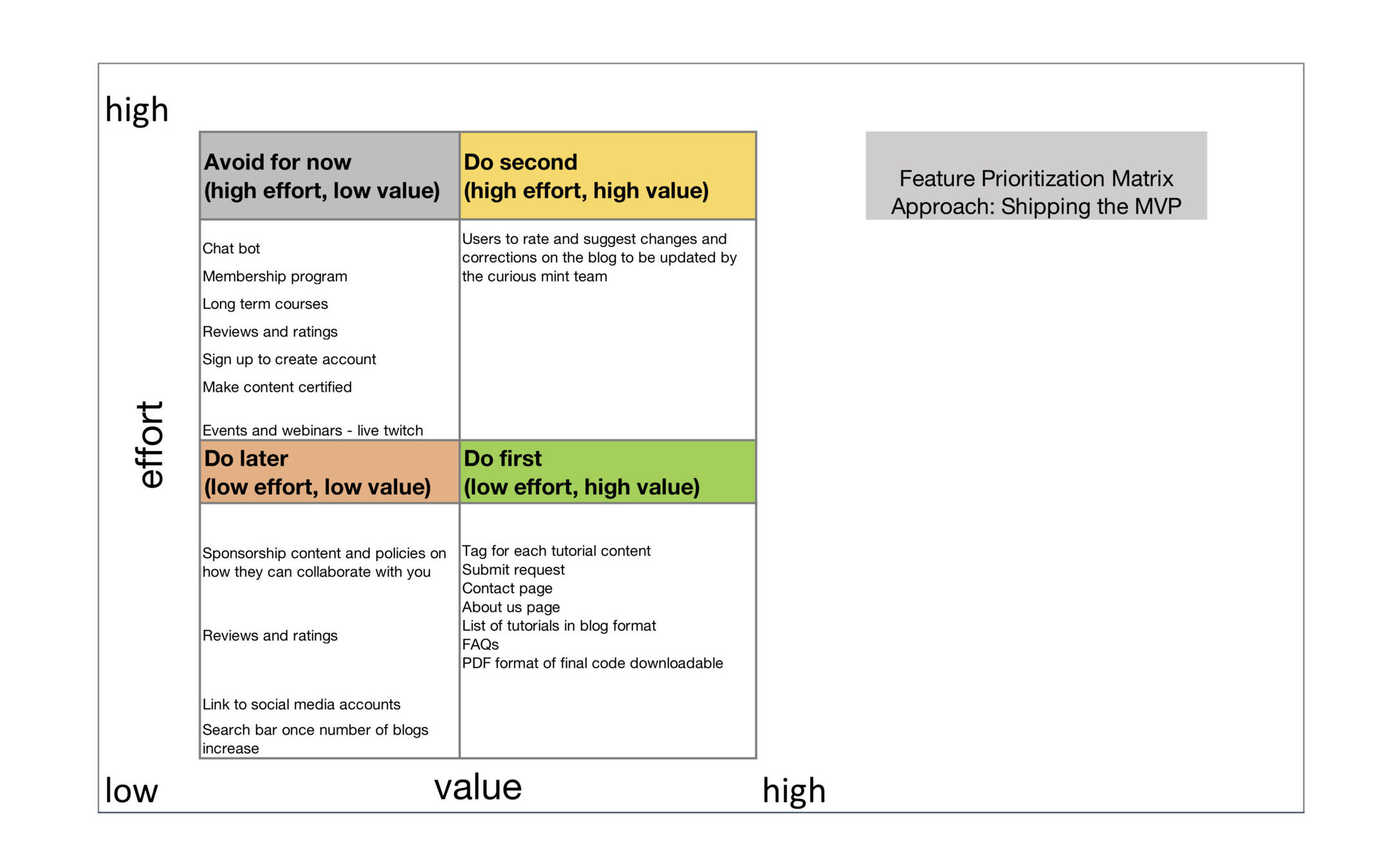
Features Matrix
The approach was to ‘ship the MVP at the earliest’. At this stage, I involved the founder, their visual designer and developer to brainstorm on features and functionality that the website should prioritize in order to ship this.
Phase 1
Create the necessary pages (landing page, about us, tutorials, submit requests).
Phase 2
Leave comment and make live changes to code request buttons, link to social media, etc.
Open Card Sort
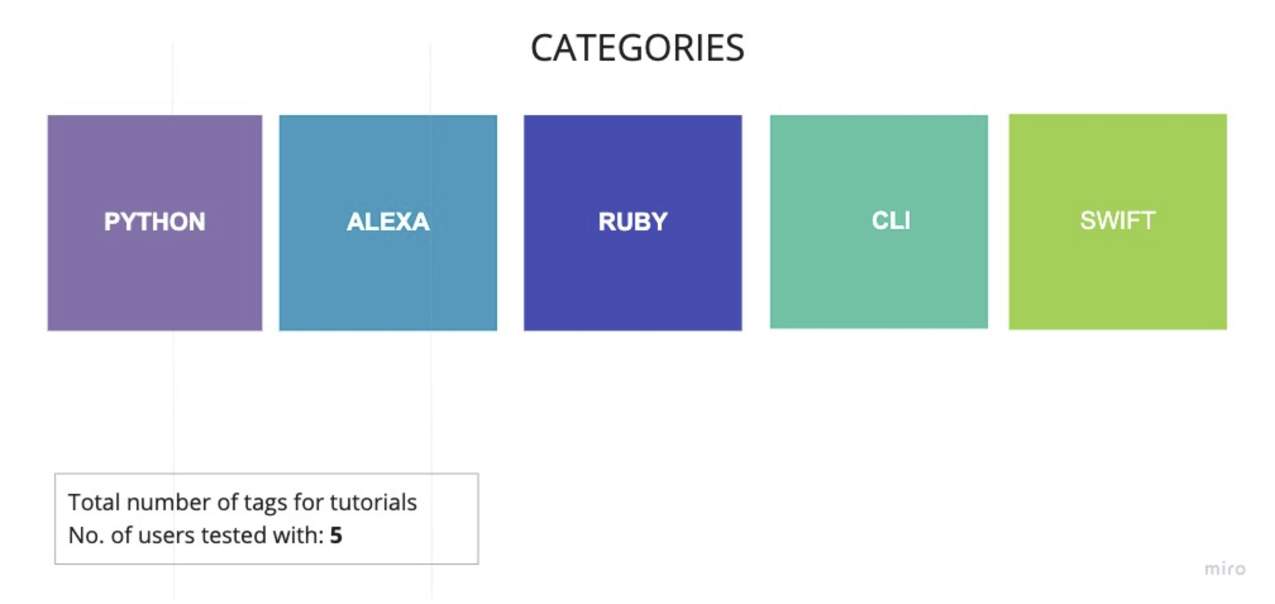
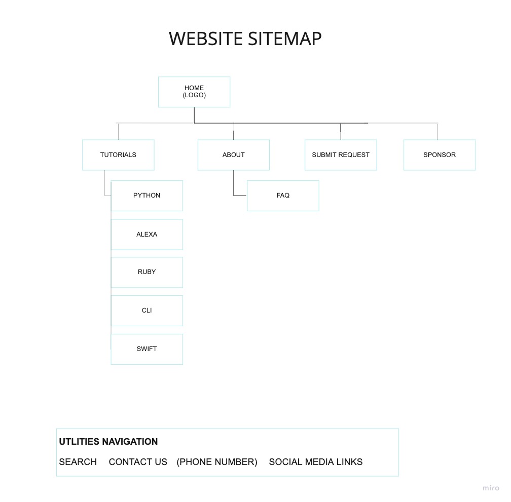
The client wanted to categorize tutorial content based on programming languages to make it easier for users to search on their website.
I conducted an open card sort exercise with 5 users. Their contacts were provided by the client. This was challenging with COVID, so we sent a list of all the tutorial content and headings to these users and asked them to label them. Based on that, we were able to identify 5 categories as the most common: Python, Alexa, Ruby, CLI and Swift.
Stage 3 – Ideate
I started with building a sitemap to get a clear direction of how the website will function and then created a user flow to define the steps visiting users would take in order to browse and view tutorials.
Sitemap
User Flow
Stage 4 – Prototype
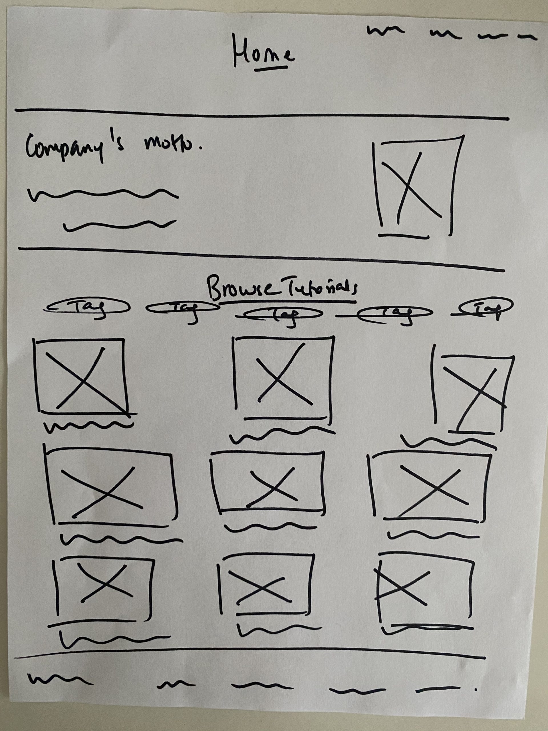
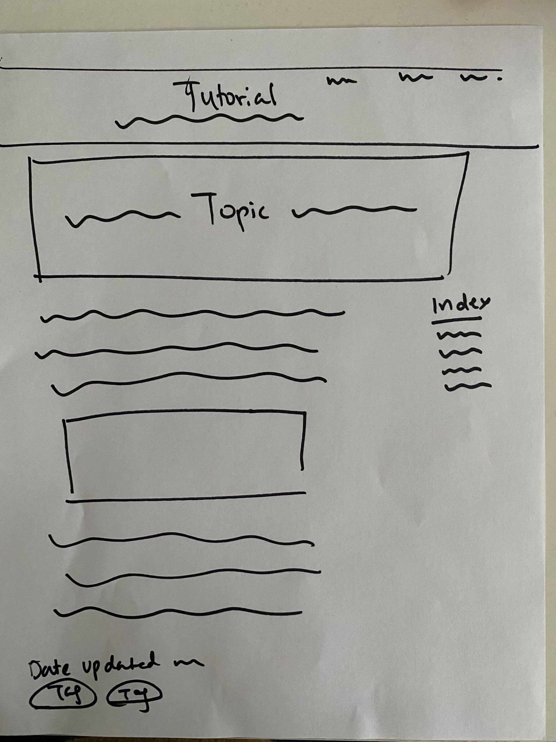
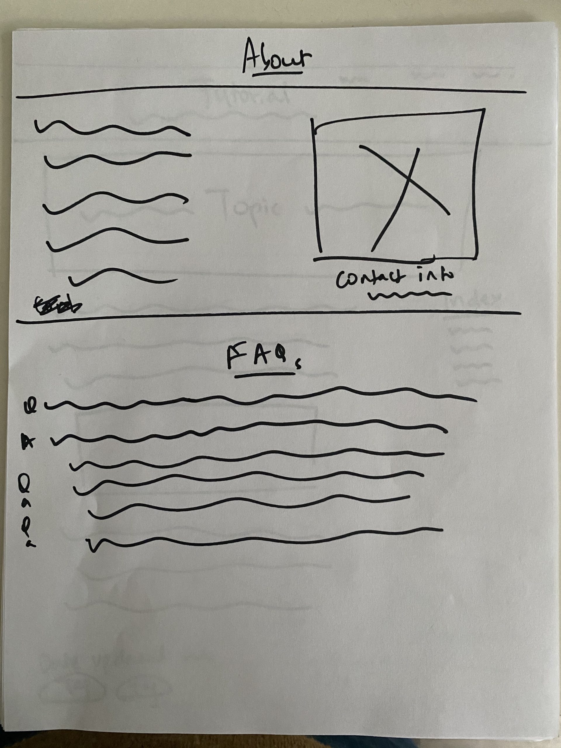
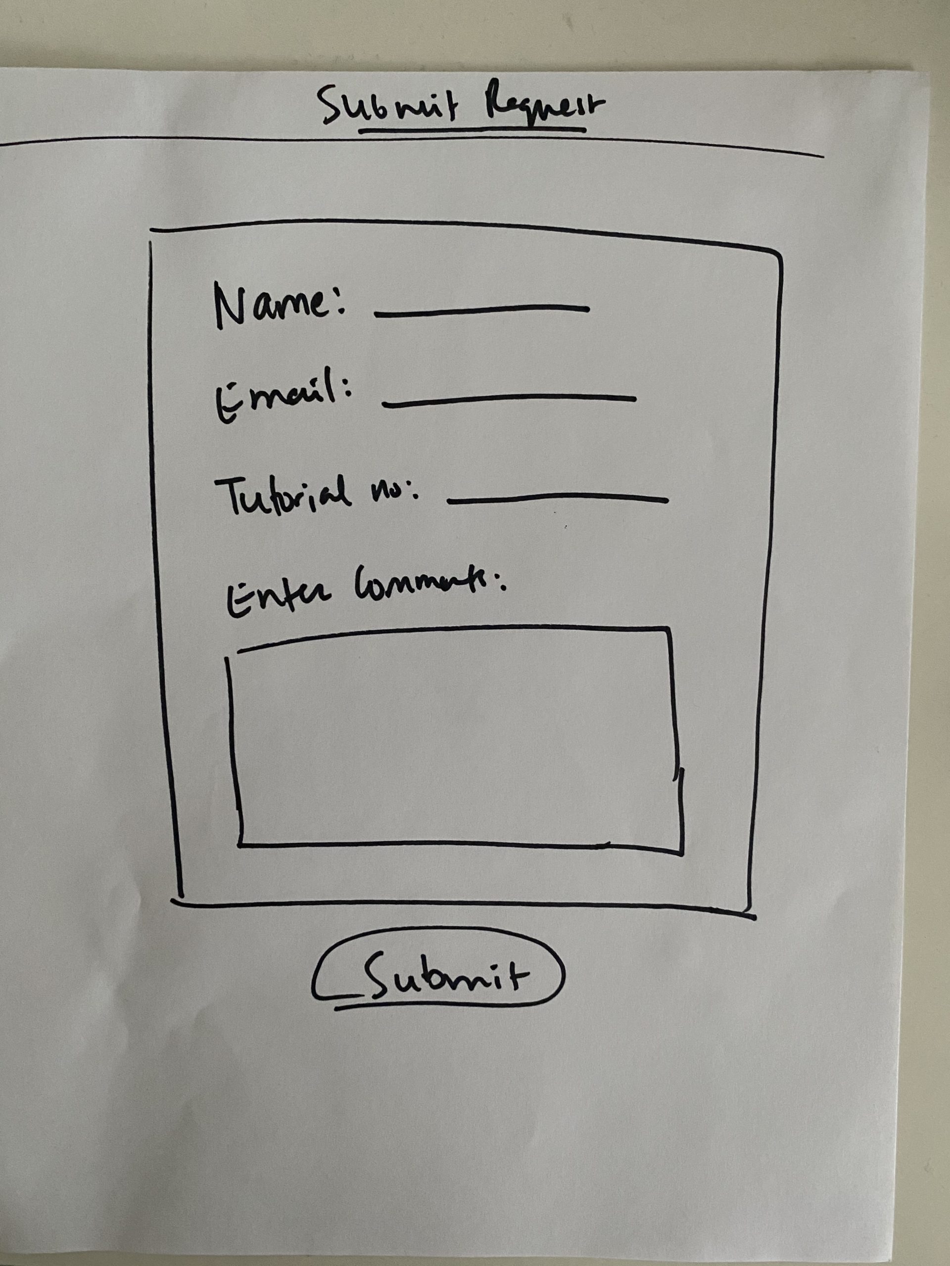
I started with paper sketches and built low to mid-fidelity wireframes so we could start testing early on and incorporate valuable feedback from the target audience, into the our design.
Note: Prototypes and wireframes are protected under NDA. I am authorized to share paper sketches for now. Once the website is live and running, I will be authorized to share more.
Stage 5 – Testing
With COVID, it was getting harder to test. I created mid-fidelity wireframes on Adobe XD and sent the files to the users to test. We were on video call to make note of feedback. They were pretty pleased with the first look and feel of the content. Few things were brought to our notice and we had it iterated.
Feedback
“This looks really clean! I’m definitely going to explore the content.”
“I can’t wait for more tutorials to be uploaded. I love that we can submit our suggestions to update the content.”
“It’s great that I don’t have to signup, but would love to see if we can create an account with Curious Mints later on, so I can bookmark and save for learning in the future.”
Stage 6 – Next Steps
The visual designer created a branding guidelines and I helped make sure it passed the accessibility test. I handed over the wireframes to them and they are now in the process of adding in their content. The website is now under development. Once it goes live, I might be called in to test it again keep the circle on.
Reflection
It was great to work with this team. They knew exactly what they wanted, and it was refreshing to see a small team with big goals and heart in the right place – where everything revolved around the culture of “what’s best for the user.” This helped me think deeper and focus more on users. The challenge here was that with COVID, it was hard to test it with more of the target audience. The next phase is going to be adding more content, and I can’t wait to help them map more experiences and features as they grow!
“I didn’t think I needed all this information but love the detailed direction that you have provided. This is super helpful! The features matrix, the personas and the competitive analysis is definitely very helpful and helps us operate better.” – Founder, Curious Mints
